Case study – The Bean
1. About the client
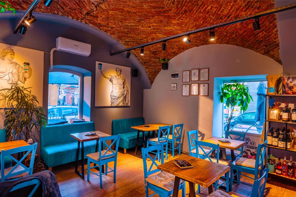
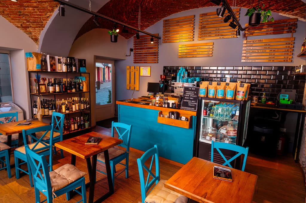
Located in the picturesque heart of Sighișoara, The Bean aims to provide an authentic and flavorful experience to all coffee lovers. Through this logo redesign, we sought to strengthen the connection between the café’s identity and the rich cultural and historical landscape of the city, offering customers not just a delicious drink, but also a journey into the heart of local traditions and authentic hospitality.
2. Mood board
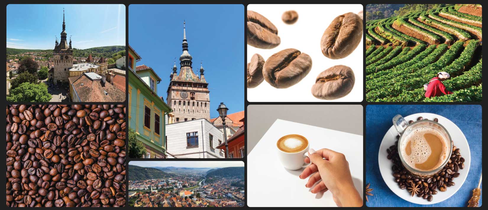
During our research and inspiration process, we explored not only the narrow and charming streets of Sighișoara but also the fascinating story of coffee in local culture. Drawing inspiration from both the past and the present, we aimed to strike the perfect balance in the design of the new logo between tradition and innovation, between elegance and originality.
3. Preliminary sketches
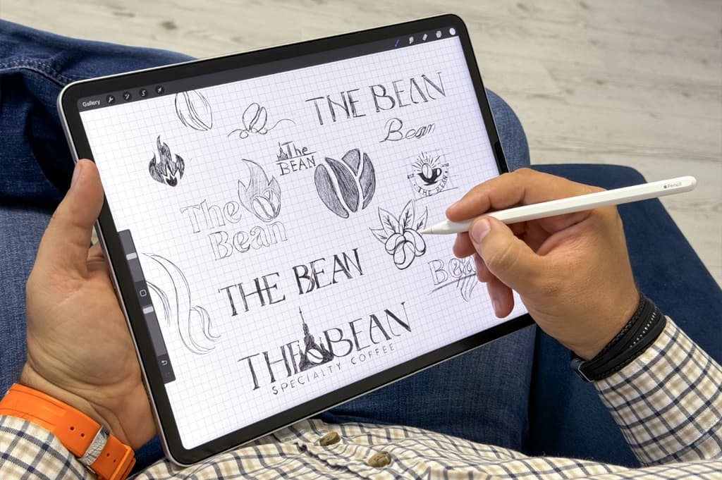
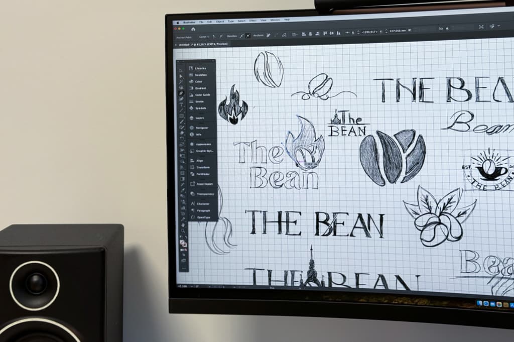
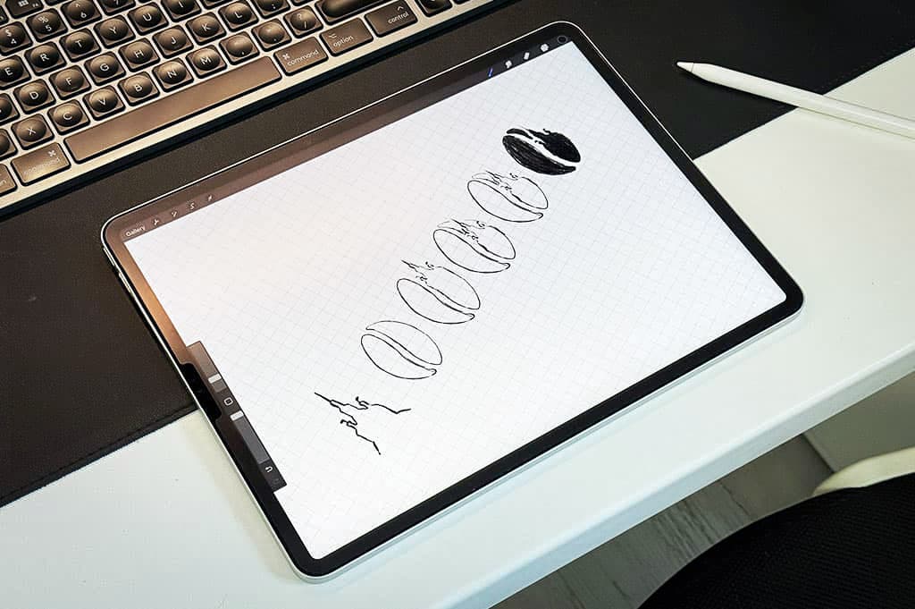
In the initial stage of the creative process, we experimented with various approaches and styles, trying to find the most expressive and relevant way to capture the essence of The Bean and the spirit of Sighișoara. From quick sketches to elaborate illustrations, we explored a wide range of ideas, always focusing on originality and visual impact.
4. Concepts
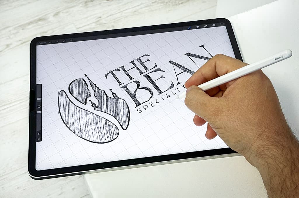
As the design process evolved, we worked closely with The Bean team to refine and adapt the initial concepts based on the feedback received and the specific requirements of the project. At this stage, we aimed to create not just an image of the café but also a captivating story that would be reflected in every aspect of the final logo.
5. Final design
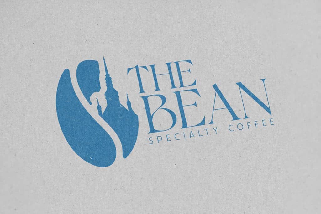
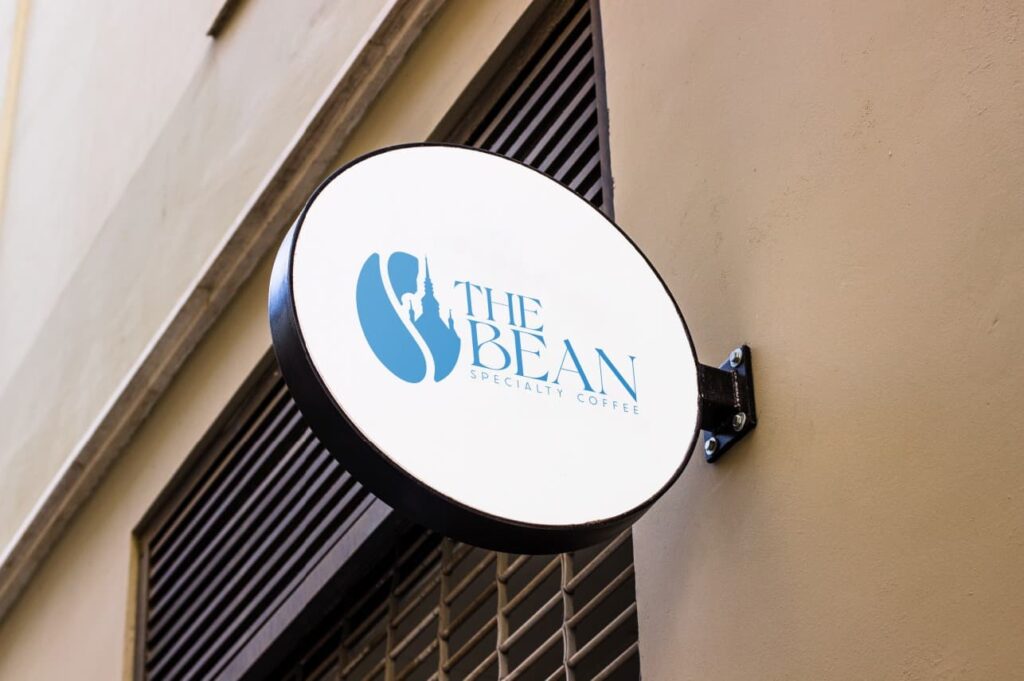
The final logo of The Bean is the result of a creative journey and close collaboration between our team and the café’s team. With every line and every shade, we tried to convey not only the exceptional quality and aroma of the coffee but also the authentic spirit of Sighișoara. With great attention to detail and a careful iteration process, we arrived at the final logo design for The Bean. It seamlessly integrates the coffee bean and the clock tower of Sighișoara, thus reflecting the strong connection between the café and its location. The chosen colors and fonts communicate professionalism and hospitality while being memorable and distinctive.
6. Label design
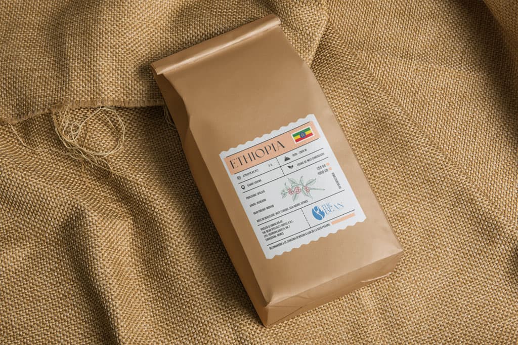
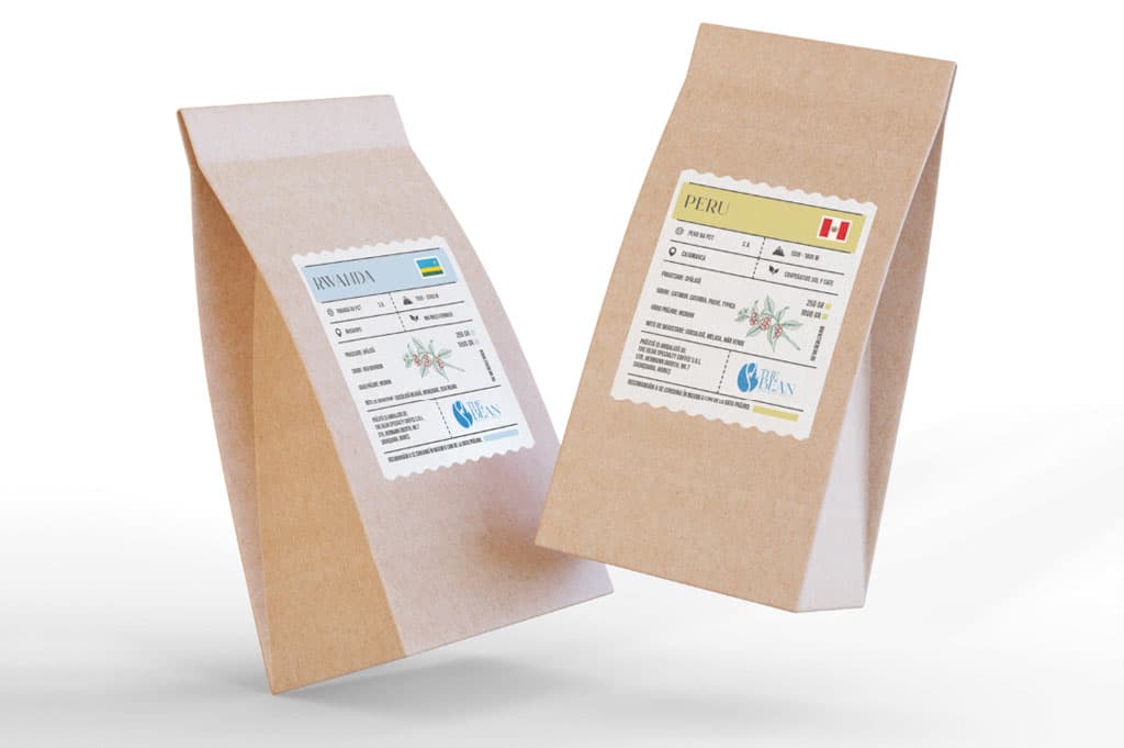
While the logo represents the starting point of The Bean’s visual identity, the labels on the coffee bags complement and emphasize the story of our brand. In this stage of the creative process, we focused on creating labels that reflect both the exceptional quality of our coffee and the unique spirit of Sighișoara.
We considered every detail, from the selection of materials and colors to the layout and the message conveyed. We ensured that every element of the design tells a captivating and authentic story about the origin and production process of our coffee, making our consumption experience even more memorable and distinctive.
Drawing inspiration from the visual elements and colors used in The Bean’s logo, we created labels that provide a natural continuation of our brand while bringing a fresh and modern touch. We made strategic choices regarding fonts, images, and the information included, so the labels are attractive and informative for our customers, regardless of the environment in which they are encountered.
